
Last post we talked about your first impression, the Project Image. If you’ve followed those tips, and have decent karma, a potential backer will have chosen your project among others to spend their 8 seconds of attention span on. It is up to you and your designer to keep them on the hook. While it may seem logical the project video is next up for the eye-test, we all know watching a five minute video about a game is a scary commitment these days - we have cat videos to watch after all. Instead, a potential backer may need a bit more persuasion down the page before they scroll back up and watch the video.
The “schmoney-Shot”
A splash image is a great way to get them committed to learning more about the campaign. If done right, it is likely the image that will stick in their mind, only to pop up later as they tell their friends about a “sweet boardgame on kickstarter I backed that you should check out.” An eye catching splash image is also critical to a good first impression and a good first impression establishes your credibility. Use your splash image to turn curiosity into interest. Here are some types and tips:
Typemark

A less-popular but highly-effective splash image some campaigns use is a distinguished type mark, displaying the title text of the game. Encourage your designer to include some simple thematic hints into the mark alongside the text so viewers can begin to associate the name of your game with it’s theme (hopefully the name begins to do this on it’s own of course). To harken back to our first post about branding your campaign, it’s important your typemark is bold and legible. This is a great opportunity to re-use a piece of art or an item that appears elsewhere in the game to make things bit easier on your artist. The main hero has a crown on in a character card for example, maybe that same crown adorns the title text in your typemark. Anytime you can have your artist enhance and re-position a piece rather than designing a completely new one will save them time and save you money. And don't be shy in this type of suggestion, designers always enjoy an idea to get the creative wheels turning.
Components

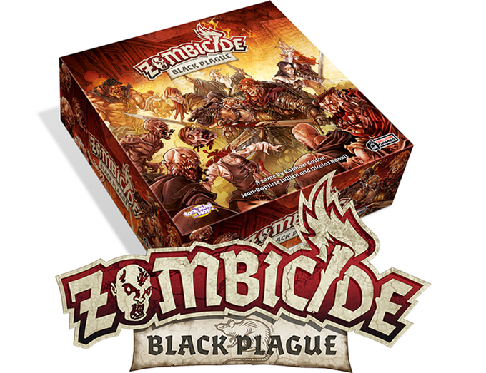
The most common splash image - for good reason - is a setup-shot of the game. Used in tandem with a gamebox project image, viewers will instantly get a full sense of the game, from the outside to the inside. This will also allow you to visually identify what type of game you want them to back - cards, resource collection, miniatures, rpg, etc. Again, a quick way to appeal to the audience looking for a specific type of game; but be weary, it's also a quick way to make someone who isn't interested in deck-building to click away.
While some games may not be far enough along in development to have a solid component-image, a good one will establish trust and show potential backers your project is nearly there, you just need their help. Remember, the more secure you can make someone feel about their donation (because that’s what it is at this point), the more donations you’ll get.
Combination
My personal favorite, a combination splash image allows you to really establish an identifying image for your game but also provide more context. For example, a splash image displaying your gamebox along with a typemark following a project image showing some artwork and components and that’s it, within the first 10-seconds of viewing and clicking your page a potential backer should have a sense of the type of game, the art-style, the components, some mechanics, and an image they can distinctly associate your game with as they proceed to share it on social networks and tell their Mom about it. #winning
Gold-Star Gif
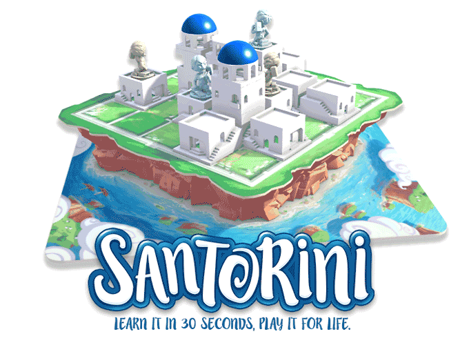
Get creative! While there definitely is a graphic-checklist to designing a successful Kickstarter campaign, you should always go with something that makes your campaign different. Of course, it becomes a question of time and money (you’ll realize this applies to everything related to your campaign) but if your artist has the chops, I say got for it. More over, at least one graphic item on your page should go above and beyond the norm, a real A+ piece that people mention as “a cool little part of the campaign.” Not only does this set you apart, but it shows backers the effort you’re willing to put in not only to the campaign, but to the game they have now pledged $50 for. The splash image is the perfect opportunity. Check the take-my-money-now gif Santorini came up with to kick off their campaign page above.
Now that you’ve got em’ hook line and sinker in Waterdeep Harbor, you can take your time to really explain the product and your team’s story. You've’ managed to prove to your viewers they don't actually have the same attention span as a goldfish and, instead, are very tasteful, cultured patrons looking for the next best game for their shelves.

With Emergence, we felt it was important we showed off our DIY prototype as much as we could - thinking the abstract look of the game made it unique - so we went with the above combination mark as our Splash Image to start. We hoped the images would at least keep people interested enough to start reading. Based on some research we had done over at Stonemaier Games, we changed some of our main graphics throughout the campaign - including the Splash Image. With about a week left, we switched up the strategy and led with all the stretch goals backers had already unlocked for Emergence. We thought some people may be reluctant to back a game that was already %800 over its goal so we decided to lead with all the reasons it would still be great to back the project. More over, slightly changing and/or updating graphics over the course of a campaign is a great way to keep backers interested. If they didn't read through the whole campaign when they first backed and, now, the campaign leads with a thematic backstory or detailed pictures of some components, they may even consider upping their pledge level. Keep an eye on the comments, you may learn that backers especially like a specific graphic or part of the campaign - consider Splashing with that. (yes, splashing...)
Section Headers are next, in Graphics Part III!
P.S. I received some great input from a few viewers on Part I of this Kickstarter Graphics discussion. I wanted to explain that yes, these posts are meant to make suggestions based on my observation and experience. I do not have analytics or market research to back up what I think is the best option - I'm far too lazy for that. I am writing these posts as way to reflect on the campaign we designed for Emergence (which was our first), to help designers creating a campaign and/or help people looking to hire a designer to create a campaign, and because I found little design/publishing advice online specific to Kickstarting a tabletop. I also try to present the best examples I can find so you will consistently see what we produced for Emergence probably wasn't as good for I am a mere grasshopper in the world of graphic design with much to learn myself (I mean, look at our Splash Image compared to Santorini...yikes - good thing I put them right next to each other!)