
Well, you've done it. You've managed to develop the theme and mechanics of your game over countless hours and finally think it’s time you reveal it to the world. You're somewhat familiar with Kickstarter, often browsing the Games section, and have even backed a few games yourself. You begin to realize there are great games that do well and great games that don’t. How could this be?
As you’ll quickly find out, creating a game people will love to play is only half the battle and behind every great product designer - let alone games - there must be a savvy marketing-wiz. And of course, marketing tells us that most people consume with their eyes first. If the crowdfunding campaign doesn't pass the eye test, it definitely won't pass the ‘sure, ill spend my fifty hard earned dollars now for a game i’ll hopefully get in six months’-test. And, shamefully, we all know how quickly the eye test occurs (this research study claims it’s only eight seconds!) You’ll need to leave all the extra fluff for your website and use the crowdfunding campaign to flex that eye candy.
In a few posts to come, we’re going to explore four basic design-components we think you and your graphic designer should consider to boost the quality of your Kickstarter campaign so that it passes the eye test. If anything, these will give you some inspiration to shoot for as you shape your campaign page. First and foremost, the project image.
The “Hook Em” Image
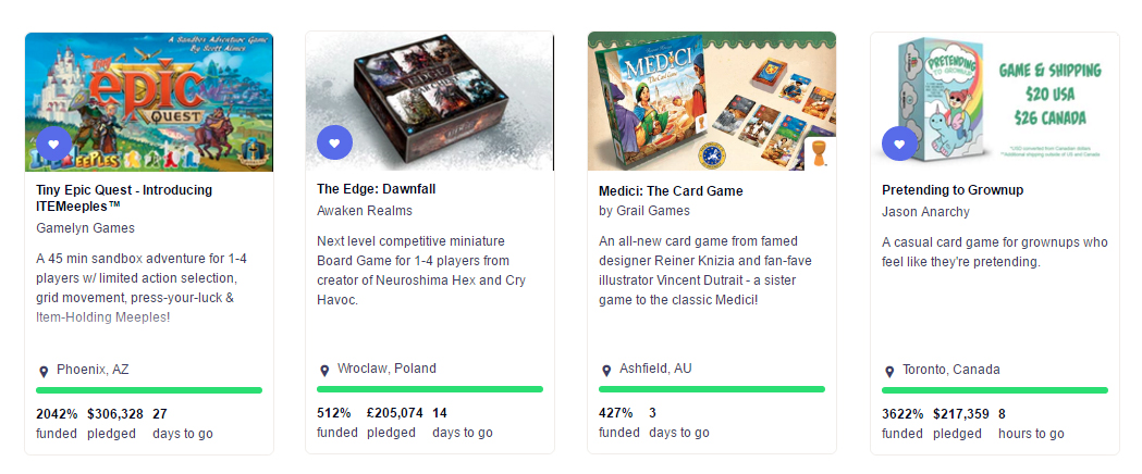
The Project Image is the first thing someone browsing Kickstarter will see, among hundreds of others. There is no specific formula on a successful project image, but there are a few things you’ll want to strongly consider and some things you’ll definitely want to avoid. And remember, above all else, the Project Image should match the overall branding of the game. The project image can be especially tough because boardgamers have such different motives for playing. Some people enjoy a deep backstory, others strategic mechanics, and some, the artwork. If your game is notably stronger in one of those categories, bring attention to that. If you’re less sure, take a look at what’s popular in the days or weeks before you launch; whatever types of images you see, consider doing the opposite.
Like our Mom convinced herself when we were going through that weird middle school phase, it can be better to stand out than to fit in.
Artwork
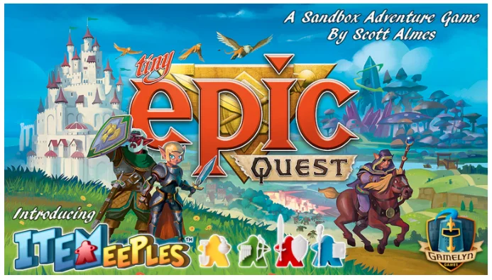
If you have some strong artwork that clearly explains both the theme and concept of the game, awesome! A great wordmark is important as well, make sure it’s legible and well-placed within the composition (create some hierarchy with size or color however - these two items should not compete with each other). The project image should be bold enough to catch someone's eye but legible enough for them to want to learn more. A small company logo also goes a long way in looking like you’ve done this before. Many campaigns use what will eventually be the cover of the game as a project image. Much like getting someone to pick your game off a retail shelf among tons of others, getting someone to click your crowdfunding campaign in a list of hundreds can be tough.
Gamebox

Backing a kickstarter project is about trust more than anything. People want to help you bring a passion project to life, and they're willing to give you money now for a big pay off later. With that said, a rendering of the “finished” product instantly begins to build credibility. It shows you not only have thought about the game mechanics and art, but about packaging the product as well. The more finished your product looks, the more likely someone is to back it. Make sure a rendering of the game box is clear and gives some sense of your game’s theme. You may also want to add some text explaining the packaging is subject to change - backers can be very finicky with their expectations at times! You can find some awesome (free) Photoshop templates online for retail packaging - make sure the resolution is good!
Components

Components are great for quickly explaining the mechanics of the game. While certain components may turn a few people off, you’ll be able to narrow down and appeal to your target market (those most likely to back it anyway). If your boardgame has an especially unique set of components or an original mechanic, you should consider showing it off in the project image. Never put components alone however, always beside a game box or over a piece of artwork. Few people are going to back a project because of a component but many people will be intrigued by an eye-catching piece of artwork and a unique component to boot.
Informational (availability, cost, time left)

Information, much like components, should always be alongside a gamebox or artwork in a project image. This is a great way to quickly highlight a particular selling point of your campaign. A great price or free shipping could swing a potential backer to check out your project over others. Regional shipping availability (especially if you can ship to Australia) is a great way to show you’ve done your research on fulfilling the game - it reassures potential backers they can trust you with their ‘pre-order.’ Many projects display the time left in the campaign during the final days or hours before it ends which is a great way to tap a potential backers fear of missing out - use it your advantage! Most campaigns see a spike in the final days; making that spike extra sharp in the project image couldn't hurt.
Our Emergence Hook'Em Image
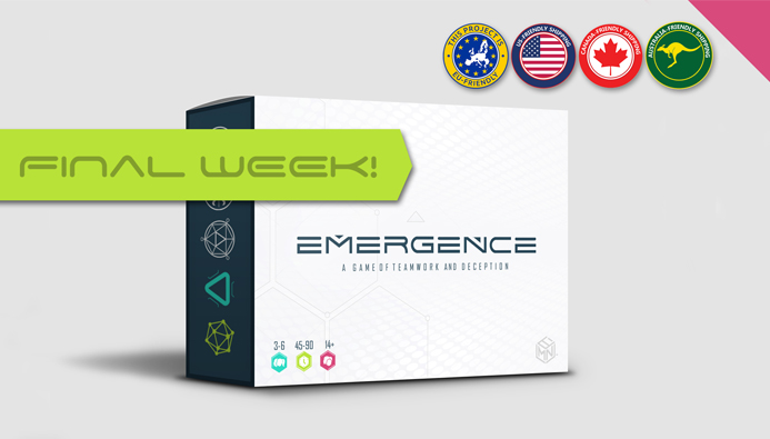
It was after carefully analyzing these different types of Hook'em Images that we opted to go with our main Kickstarter image. We would like to think that the time we spent creating our hook'em image was a big factor in our success of raising $93,000+ on our first project. (the image shown was our final week warning).
And there you have it. The major types of project images you’ll find in boardgame-related Kickstarter campaigns. Be wise young grasshopper. Do not rush your choice for it may yield unending rewards or merciless sorrow. Let the project image speak to you. Be one with it. Love it.
Creating a solid Splash Image to come, in Part II