
Ah, yes, the highly touted Stretch Goal section of your tabletop Kickstarter campaign. Most creators would agree stretch goals are an important part of reaching your funding goal versus exceeding it by nearly 1000% (yes, our goal was modest). Great stretch goals create a better product which adds value to your backers. Stretch goals also give backers an incentive to spread the word about your campaign. As there are already numerous resources on establishing stretch goals and because I'm a mere designer - I am going to discuss what I've found to be some successful ways to display those goals. Hopefully, by the end of this post, you'll be well-equipped with design ideas for the essentials of your campaign page: the Project Image, a Splash Image, your Section Headers, and Stretch Goal graphics.
TYPES OF DISPLAYS
There are a few ways to present your Stretch Goals with varying levels of effort from your artist. You'll never want to use simple Kickstarter standard text, by itself, for displaying Stretch Goals - most people like to see the upgrade in some graphic form. It gets them excited! I might also add that, because they're Stretch Goals that you've yet to design (that would be risky after all, what if you don't reach that goal), it's fine to display something that roughly exemplifies the goal. Much like the Splash Image, the Stretch Goal section is a great place to re-use some graphic pieces to lighten the load on your artist. Here are some basic levels of effort I found sifting through a number of successful tabletop campaigns:
Campy Creatures by Keymaster Games
Dice Thrones by Mind Bottling Games, LLC
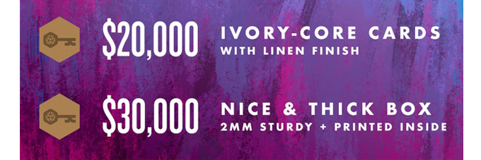
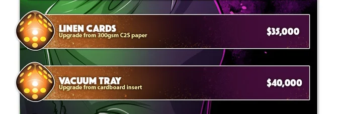
'BASIC' TEXT
The above examples are pretty self explanatory. Both consistently meet the graphic quality of the rest of the campaign and they have great hierarchy - the stretch goal amount always being the priority - and generally get the point across well. They're also very easy for the artist to create. No frills and no lollygaging here; they get the job done. While these stretch goal graphics may not turn an un-committed browser into an excited backer, they do give people who have already supported the campaign some incentive to up their pledge or share it with friends. This should be your minimum baseline to shoot for.
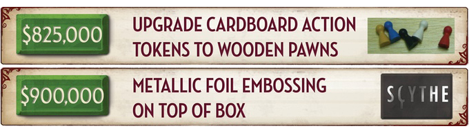
Scythe by Stonemaier Games

Emergence by, well, yours truly :D
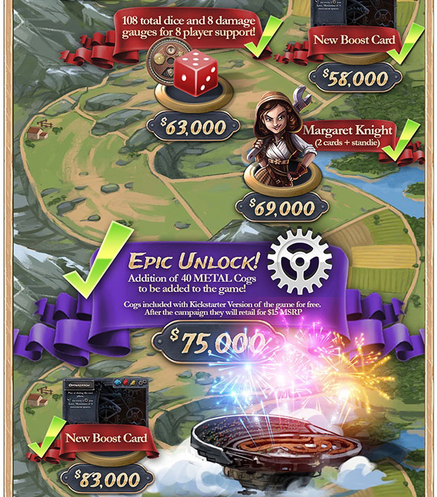
TEXT + EXEMPLARY IMAGE
This level of effort is where most tabletop campaigns tend to fall in my research. I suspect this is because most creators have sincerely thought about ways to increase the quality of the game but eventually realized how expensive certain components can be. While they have yet to commit the time (which I talked about at the bottom of the post here) in designing and prototyping the component, they recognize the value in showing potential backers an example of what the component could be. Not only is this more effective than text-only, it's relatively easy for your artist to grab a generic image off google and slap your game logo on it. Don't waste your time designing-out a detailed insert (unless you think your dice will be SUPER sick and worth showing in all their glory) and, instead, grab one off of Google. Remember, "designs are subject to change" - always!

Relic Knights: 2nd Edition by Ninja Division Publishing & Soda Pop Miniatures


The World of SMOG: Rise of Moloch by CMON
DESIGN MOCKUP
So, I sort of have mixed emotions about campaigns that can get to this level of graphics. Of course it is great to present a component that has been fully designed and prototyped (something that is essentially game box-ready) that is cost-prohibitive. If a backer sees wooden cubes compared to custom, laser-cut resource components, they're surely going to be more inclined to share the project or up their pledge. However, if you have additional character cards, for example, that are clearly print-ready and are cost-negligible (printing five cards vs ten cards typically is), I would argue that's not really a stretch goal but rather something you're withholding from backers to benefit your bottom line. Perhaps that's fine, some campaigns are more business than they are passion-projects after all. I do think there is some cause for pause at, however.
Anyhow, if you have the ways and means to create a mockup of the upgrade or new component, do it. You're likely to really see a huge difference in support at this graphic level. If the stretch goals are well thought out and sincerely add value, your artist's time spent designing them won't be in vain. One-time page visitors will become top tier backers and advocates for backing your project within their gaming groups.
Steampunk Rally by Roxley Games

Santorini by Roxley Games
DESIGN MOCKUP + CUSTOM GRAPHIC
Yes, those examples are pretty slick. And yes, they take a lot of time to create for something one may argue isn't necessary. Images similar to the above examples above are indicative of the most successful boardgame campaigns you tend to see on Kickstarter. Creators that were willing to take the time and put in the effort to every facet of their campaign page - much like they probably did their game. It really establishes credibility and trust - a continued motif throughout these graphics-related posts. By giving maximum effort, even in the stretch goal section, you're likely to adopt some life-long supporters. There is no greater feeling, months down the line, to hear from someone that enjoyed the game and the campaign so much they're "100% in on the next game." Enough of those emails and you'll quickly be questioning your day job hehe.
*You'll notice the Santorini example is repeatable too - which is a resourceful way to create something like this.

For our page, we went with something we had yet to see done on a boardgame campaign and added a little flare to a Text + Exemplary Image graphic. Again, for the gif, I set up a frame by frame template on Photoshop where I merely changed the text and image for each goal in the first frame which made each gif. easy to make. We used graphics we had already made for component-upgrade goals, exemplary images (subject to change) from the internet, and even designed-out a few goals we thought would be worth showing. The insert, for example, was something we spent time creating a legit graphic for thinking people would be more inclined to reach the goal if they saw what the actual insert may look like. We also thought it would add some fun for backers to assign Stretch Goal 'Tiers' - mostly so they had an overall benchmark to shoot for. "Oh man, we've almost made it to those Tier 3 Stretch Goals, sweet..(was something no one said but, in theory, it made sense)."
As I mentioned in a prior post, about midway through the campaign we moved the Stretch Goals that backers had already unlocked to the start of the page. Perhaps this would give people who weren't otherwise interested in backing an already funded project some incentive to pledge. We saw a few other campaigns employ this at the time so we jumped on the wave. As far as updating the Stretch Goals, we shared all goals and funding amounts for each Tier and once a Tier was completed, we would post the next Tier in its entirety. Each tier had fewer goals that were more spread out and harder to reach - which is commonplace. It was a way for us to satiate backer's appetites but not show our full hand (because lets be honest, after like $50k we were coming up with goals on the fly).
We'll be breaking down the awesome Anachrony KS page next section. Keep it locked!